Put the chat widget on your website
After this guide, visitors to your website can talk to your agent from a bubble in the corner. You create the widget in the dashboard, paste one line into your site, and change how it looks any time — without touching the code again.
Chat bubble or voice orb?
There are two widget types, and the type decides how visitors interact — there is no separate mode switch. Pick the one that fits your website; if you want both on a page, create two widgets.
| Type | What visitors get |
|---|---|
| Chat Widget | A classic chat bubble — visitors message your agent and read replies inline. |
| Voice Widget | A voice orb — visitors talk to your agent and see rich answer cards in a full-screen, voice-first view. |
In the dashboard, click Deploy in the left menu, then Connect a channel. Under Web you'll find both Chat Widget and Voice Widget — each marked Instant. Click Add to your site on the one you want. You land in the widgets list; for the Voice Widget, the create dialog opens for you with the orb preselected.
In the Create Widget dialog, enter a Widget Name and select the Agent that should answer. Optionally list Allowed Domains (comma-separated, like example.com, app.example.com) so the widget only runs on your own site — more on that below. The Type field is read-only.
For chat widgets you can also switch on Voice dictation (a mic button so visitors can speak instead of typing) and File upload (visitors can attach PDF, Word, Excel, CSV, text, Markdown, or JSON files up to 10MB for the agent to read).
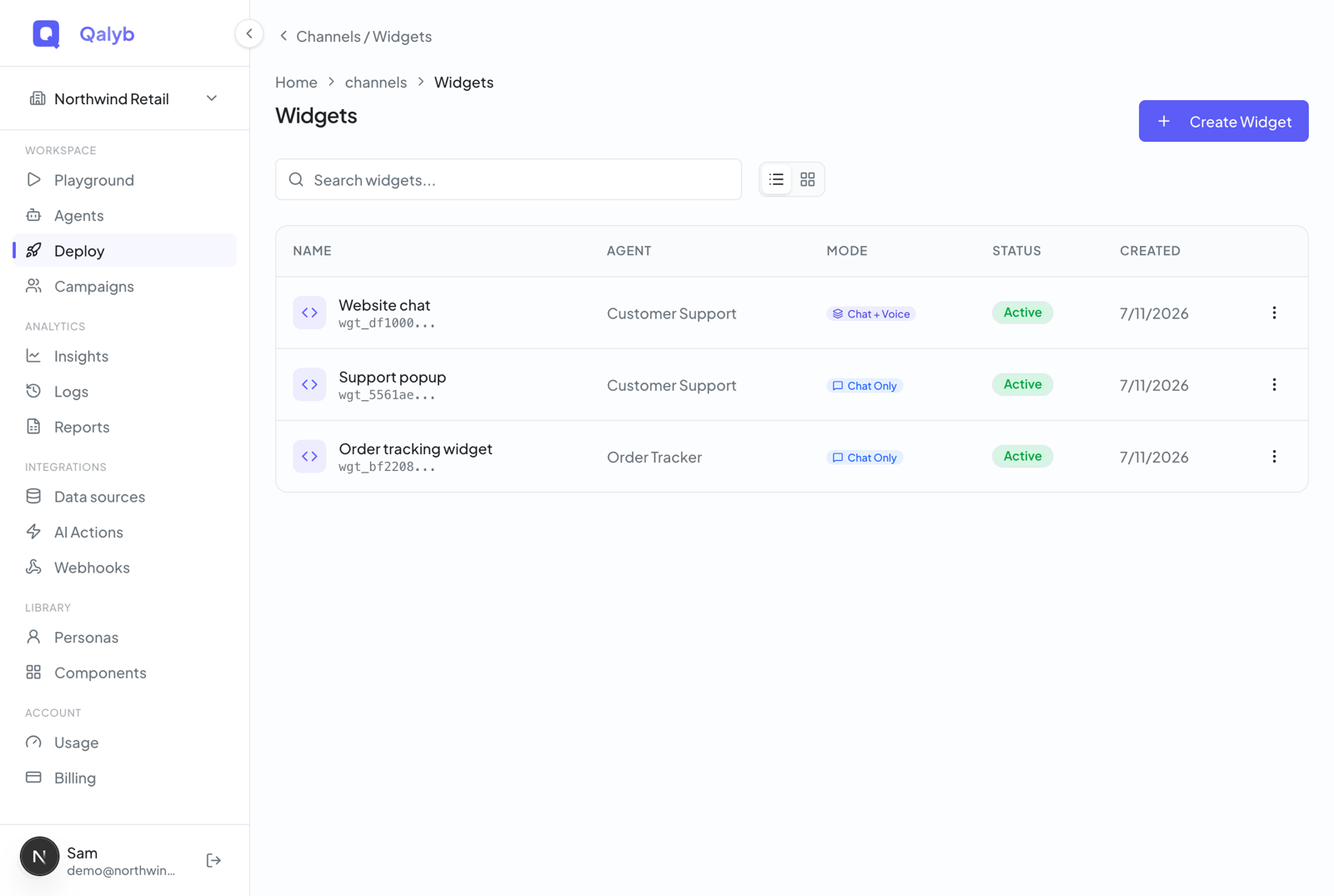
Click Create Widget. A one-time dialog shows the widget's full token. Copy it and store it somewhere safe — after this dialog, only a short prefix of the token is ever shown again.
Open your new widget and go to its Embed tab. The simplest option is the script tag — paste it anywhere in your page's HTML and replace the placeholder with the full token you just saved:
<script
  src="https://cdn.qalyb.ai/widget.js"
  data-qalyb-token="YOUR_FULL_WIDGET_TOKEN"
  async
></script>This works on any website, CMS, or page builder that lets you add a <script> tag — WordPress, Webflow, Shopify, plain HTML, and more. For exactly where to paste it on each platform, see Embed your agent anywhere.
Open your site in a fresh tab. The launcher appears in the corner — click it and send a message.
Make it match your website
Click the widget's row to open the editor: settings on the left in three tabs — Appearance, Content, and Embed — and a live preview on the right that shows the real widget as you type. Save Changes appears in the top bar only when you have unsaved edits.
Appearance
| Setting | Options |
|---|---|
| Theme | Light, Dark, or Auto (follows the visitor's system). |
| Position | Bottom Right or Bottom Left. |
| Primary Color | Color picker + hex input. Default #5C5CF6. |
| Accent Color | Color picker + hex input. Default #06B6D4. |
| Border Radius | Slider, 0–32px. Default 16. |
Content and launcher
The Content tab controls what happens when the page loads, what the launcher looks like, and the text inside the widget.
- On load — show the launcher button, or open the widget directly. For the orb this reads Show launcher button (open orb on click) vs Show orb directly.
- Launcher style — Icon button (a round icon) or Labeled FAB (a pill with text).
- Launcher icon — Chat, Bot, Sparkles, or Voice.
- Launcher label and subtitle — e.g.
Ask Noura/AI guide(shown on the labeled FAB). - Title (defaults to the agent name), Subtitle (e.g.
Online now), and Welcome Message (defaults to the agent's greeting). - Logo URL and Auto-open on page load.
- Chat input — the Voice dictation and File upload toggles (chat widgets only).
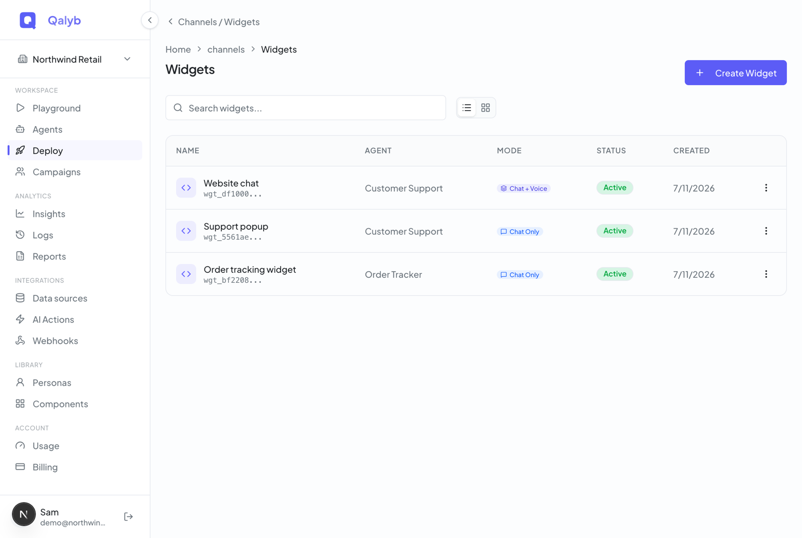
The preview on the right is the real widget, so what you see is exactly what visitors get. Use the refresh icon to reload it, or the external-link button to open it in a new tab. Your in-progress edits show up immediately, before you click Save.
Lock it to your own website
Origin not allowed for this widget. An empty list allows any site — convenient for testing, but lock it down before you go live.Turn a widget off
Both actions are admin-only. Revoke deactivates the token and flips the status badge to Revoked (red) while keeping the row for your records. Delete removes it permanently and immediately disables the widget on every site where it's embedded.
For developers
The Embed tab offers two more ways to install the widget besides the script tag. All three load the same bundle from cdn.qalyb.ai/widget.js. For more control, load the bundle and call window.Qalyb.init(...) yourself:
<script src="https://cdn.qalyb.ai/widget.js"></script>
<script>
  window.Qalyb.init({
    token: 'YOUR_FULL_WIDGET_TOKEN',
  });
</script>
In a React or Next.js app, import the component from the @qalyb/widget package:
import { QalybWidget } from '@qalyb/widget';

export default function App() {
  return <QalybWidget token={process.env.NEXT_PUBLIC_QALYB_WIDGET_TOKEN} />;
}
For every data-qalyb-* attribute and the full JavaScript API, see the embed script reference.