Embed script & control
One script tag puts your widget on any page. After that, the window.Qalyb API is your remote control — open, close, toggle, and send messages, all wired to your own buttons and app logic.
How the loader works
Every Qalyb widget you create in Deploy is backed by a secret widget token. The token connects one agent to your site. The public loader at https://cdn.qalyb.ai/widget.js reads that token, fetches the widget's saved appearance and behavior, mounts the UI, and exposes a control API on window.Qalyb.
The bundle is the @qalyb/widget package — a tiny Preact app. It does two things on load: it auto-mounts if it finds a script tag carrying data-qalyb-token, and it attaches the window.Qalyb object so you can drive the widget yourself.
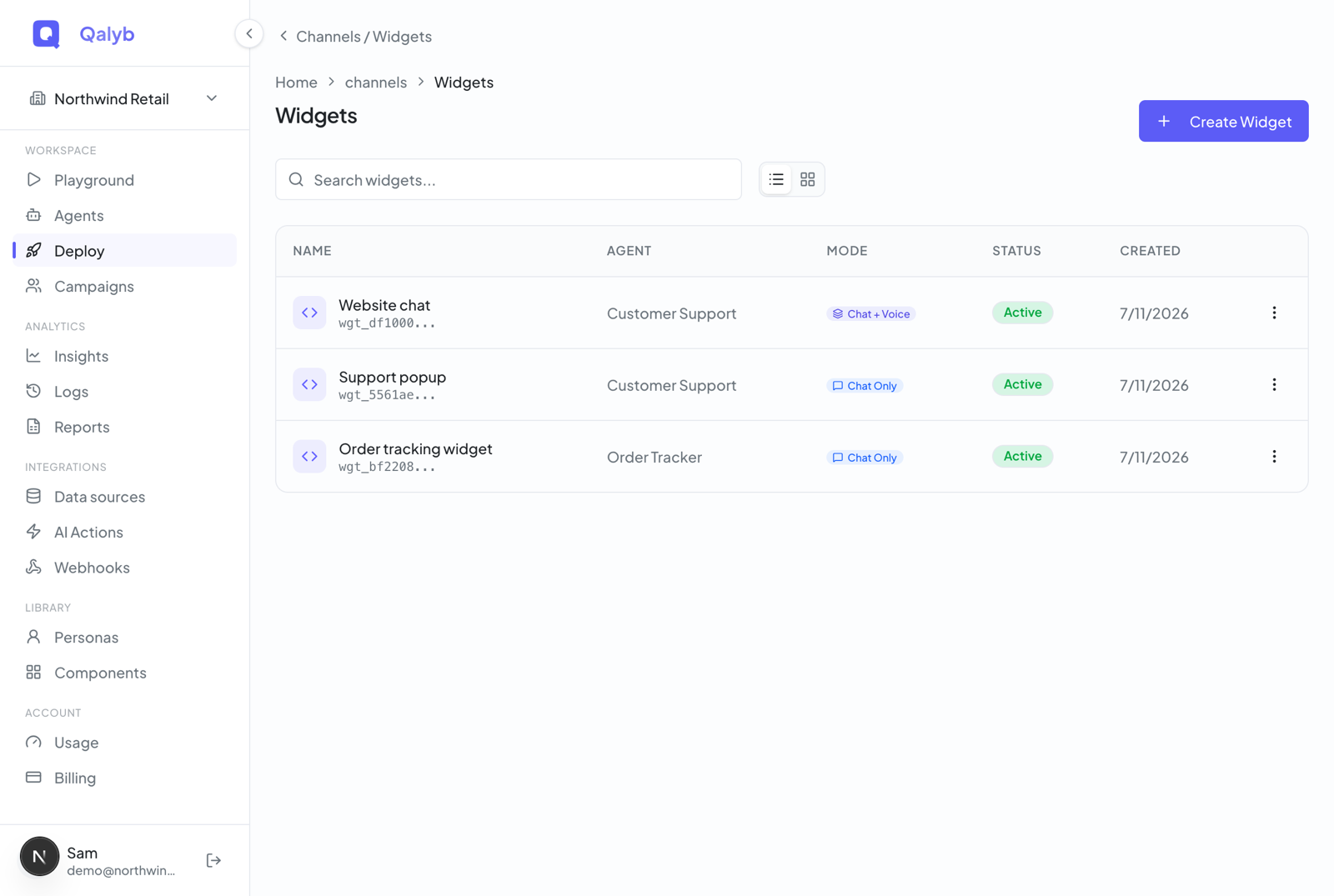
... as a placeholder. The full secret is shown exactly once, at widget creation. Substitute that real value for data-qalyb-token / token before going live — the prefix alone will not authenticate.1. Drop in the script tag (recommended)
The simplest install: paste one <script> tag before </body>. On DOMContentLoaded the loader finds the tag by its data-qalyb-token attribute, reads every other data-qalyb-* attribute as config, and mounts the widget — no further code needed.
<script
  src="https://cdn.qalyb.ai/widget.js"
  data-qalyb-token="wgt_yourfulltoken"
  data-qalyb-mode="chat"
  data-qalyb-title="Acme Support"
  data-qalyb-subtitle="Online now"
  data-qalyb-launcher-label="Ask Acme"
  data-qalyb-launcher-variant="pill"
></script>
Copy a pre-filled version of this snippet (with your appearance already baked in) from the Embed tab of the widget editor.
Common data-qalyb-* attributes
| Attribute | Values | Notes |
|---|---|---|
data-qalyb-token | string | Required. Your full widget token. The presence of this attribute auto-mounts. |
data-qalyb-mode | chat / voice | Matches the widget's type. A Chat Widget is chat; a Voice Widget is voice. |
data-qalyb-surface | classic / voice-widget | classic is the chat bubble; voice-widget is the voice orb canvas. |
data-qalyb-theme | light / dark / auto | Defaults to light. |
data-qalyb-position | bottom-right / bottom-left | Launcher and panel anchor. |
data-qalyb-primary-color | hex | Optional first-paint brand color, e.g. #5c5cf6. The agent's branding (set in the dashboard) always wins once the widget config loads. |
data-qalyb-title | string | Header title. Also data-qalyb-subtitle and data-qalyb-welcome-message. |
data-qalyb-launcher-label | string | Launcher text, e.g. Ask Acme — with it the launcher renders as an icon + text pill; without it, icon only. data-qalyb-launcher-variant can still force a specific content mode. |
data-qalyb-launcher-icon | chat / bot / sparkles / voice / help / headset / zap / smile | Launcher icon glyph. Or set data-qalyb-launcher-icon-url to a hosted SVG/PNG to use your own icon (it wins over the glyph). |
data-qalyb-teaser | true / false | The welcome message pops above the launcher as a dismissible bubble for visitors who never opened the chat. On by default — set false (or turn it off in the dashboard) to disable. Optional data-qalyb-teaser-message (custom copy; a line break splits it into two bubbles) and data-qalyb-teaser-delay (seconds before it appears, default 5). Opening or dismissing it turns it off for that visitor. |
data-qalyb-start-call-label | string | Text for the voice widget's start-call button, e.g. Talk to me. |
data-qalyb-start-call-display | icon / text / both | Whether the voice widget's start-call button shows the phone icon, the label text, or both. Pairs with data-qalyb-start-call-label. |
data-qalyb-launcher-variant | icon / text / pill | Launcher button content: icon only, label text only, or icon + text (pill). Pairs with data-qalyb-launcher-label. |
data-qalyb-display-mode | transparent / fullscreen / floating | How the voice widget's orb opens: floating transparently over the page (default), as a branded full-screen takeover, or inside a compact floating panel. |
data-qalyb-launcher-position | top-left … bottom-right | 9-point anchor for the voice widget launcher (and floating panel): top/middle/bottom × left/center/right, e.g. bottom-center. |
data-qalyb-auto-open | true | Open the panel automatically on page load instead of showing only the launcher. |
2. Or initialize from JavaScript
If you prefer to control mounting yourself — for example, only after a consent banner is accepted — load widget.js without the data-qalyb-token attribute and call window.Qalyb.init() when you're ready. The config object takes the same fields as the data attributes, in camelCase.
<script src="https://cdn.qalyb.ai/widget.js"></script>
<script>
  window.Qalyb.init({
    token: "wgt_yourfulltoken", // your full widget token
    mode: "chat",
    theme: "light",
    position: "bottom-right",
    borderRadius: 16,
    title: "Acme Support",
    subtitle: "Online now",
    welcomeMessage: "Hi! How can we help?",
    autoOpen: false,
    surface: "classic",
    launcherLabel: "Ask Acme",
    launcherIcon: "chat",
    launcherVariant: "pill",
  });
</script>init() again replaces the current instance — the loader destroys the existing widget first, so it is safe to re-init with new config.3. Or use the React component
For React and Next.js apps, import QalybWidget from the @qalyb/widget package. It mounts on render, unmounts on cleanup, and accepts the same config as props plus lifecycle callbacks (covered below).
import { QalybWidget } from '@qalyb/widget';

export function App() {
  return (
    <QalybWidget
      token="wgt_yourfulltoken" // your full widget token
      mode="chat"
      theme="light"
      position="bottom-right"
      borderRadius={16}
      title="Acme Support"
      subtitle="Online now"
      launcherLabel="Ask Acme"
      launcherIcon="chat"
      launcherVariant="pill"
      autoOpen={false}
      surface="classic"
      onOpen={() => console.log('widget opened')}
      onMessage={(m) => console.log('message', m)}
    />
  );
}@qalyb/widget ships the CDN bundle and the React component. The script-tag install at cdn.qalyb.ai/widget.js works on any site today and needs no package install. Use the React import where you already have a build pipeline.The control API
Once widget.js has loaded, window.Qalyb exposes these methods. They all act on the single mounted widget instance.
| Method | Returns | What it does |
|---|---|---|
Qalyb.init(config) | void | Mount (or remount) the widget with the given config object. |
Qalyb.open() | void | Open the chat or voice panel. |
Qalyb.close() | void | Collapse the panel back to the launcher. |
Qalyb.toggle() | void | Open if closed, close if open. |
Qalyb.sendMessage(content) | Promise<ChatMessage> | Send a chat message as the visitor; resolves with the agent's reply. |
Qalyb.destroy() | void | Unmount the widget and remove it from the page. |
init, open, close, toggle, sendMessage, and destroy are the complete public surface of window.Qalyb. There is no documented method beyond these — anything else is not part of the contract.Open, close, toggle
The most common pattern is wiring the widget to a button you already have on the page — a "Need help?" link in your nav, a hero CTA, or a footer item. Hide the built-in launcher (set hideLauncher on the embed) and drive everything yourself.
// The launcher button on your page
const button = document.querySelector('#open-support');

button.addEventListener('click', () => {
  window.Qalyb.open();
});

// Toggle from anywhere
document.querySelector('#help-link')?.addEventListener('click', () => {
  window.Qalyb.toggle();
});

// Close it when the user finishes a flow
window.Qalyb.close();
Send a message programmatically
sendMessage() posts a message as if the visitor typed it and resolves with the agent's ChatMessage reply (id, role, content, timestamp). Use it to seed a conversation from a button — for example, a "Track my order" CTA that opens the widget and asks the question for the user.
// Send a message on the visitor's behalf (chat-enabled widgets).
// Resolves with the agent's reply.
try {
  const reply = await window.Qalyb.sendMessage('What are your opening hours?');
  console.log(reply.role, reply.content); // "assistant", "We're open 9–6 ..."
} catch (err) {
  console.error('Send failed:', err.message);
}sendMessage() only works with a Chat Widget token — a Voice Widget (orb) token rejects chat messages on the server. Voice calls start from inside the orb itself; there is no page-level API for them.Tear down and remount
In single-page apps, call destroy() on route changes where the widget shouldn't appear, and init() again where it should. (The React component handles this for you automatically on mount and unmount.)
// Tear the widget down (e.g. on a single-page-app route change)
window.Qalyb.destroy();

// Re-create it later with fresh config
window.Qalyb.init({ token: 'wgt_yourfulltoken', mode: 'chat' });
Events & lifecycle callbacks
The React QalybWidget component accepts callback props that fire as the visitor interacts. These are the events Qalyb surfaces — use them for analytics, support handoffs, or custom UI:
| Callback | Fires when | Payload |
|---|---|---|
onOpen | The panel opens. | — |
onClose | The panel closes. | — |
onMessage | A message is added to the thread. | ChatMessage |
onError | An error occurs in the session. | Error |
import { QalybWidget } from '@qalyb/widget';

export function SupportWidget() {
  return (
    <QalybWidget
      token="wgt_yourfulltoken"
      mode="voice"
      surface="voice-widget"
      onOpen={() => track('widget_opened')}
      onClose={() => track('widget_closed')}
      onMessage={(message) => track('widget_message', { role: message.role })}
      onError={(error) => report(error)}
    />
  );
}Restricting where the widget can load
Each widget token has an Allowed Domains list, set in the dashboard. Qalyb enforces it server-side: the request's Origin/Referer hostname must match an entry (exact or subdomain) or the API rejects it with Origin not allowed for this widget. Leaving the list empty allows any origin — fine for testing, but scope it to your real domains before launch so a leaked token can't be embedded elsewhere.
Putting it together
<script> from the Embed tab before </body>, replacing the prefix placeholder with your full token.window.Qalyb.open(), toggle(), or sendMessage() from your page's controls.Related guides
- Create & embed a widget — the dashboard flow for tokens, appearance, and the Embed tab.
- Web widget channel — chat vs. voice widgets, customization, and how the embedded runtime behaves.