Rich replies in chat
Instead of describing your pricing in a wall of text, your agent can show a pricing card. Instead of asking for details across five awkward turns, it can show a form. This page shows you how to build these rich replies — called components — by describing what you want.
A component is a piece of interactive UI your agent can drop straight into a chat or website-widget conversation — a card, a form, a chart, a live order tracker. You build it once, attach it to one or more agents, and each agent decides on its own when the moment is right to show it. Components live under Library in the dashboard sidebar.
Build your first component
In the sidebar, open Library → Components. You'll see two tabs: My components (the ones your organization owns) and Templates (ready-made starters anyone can copy).
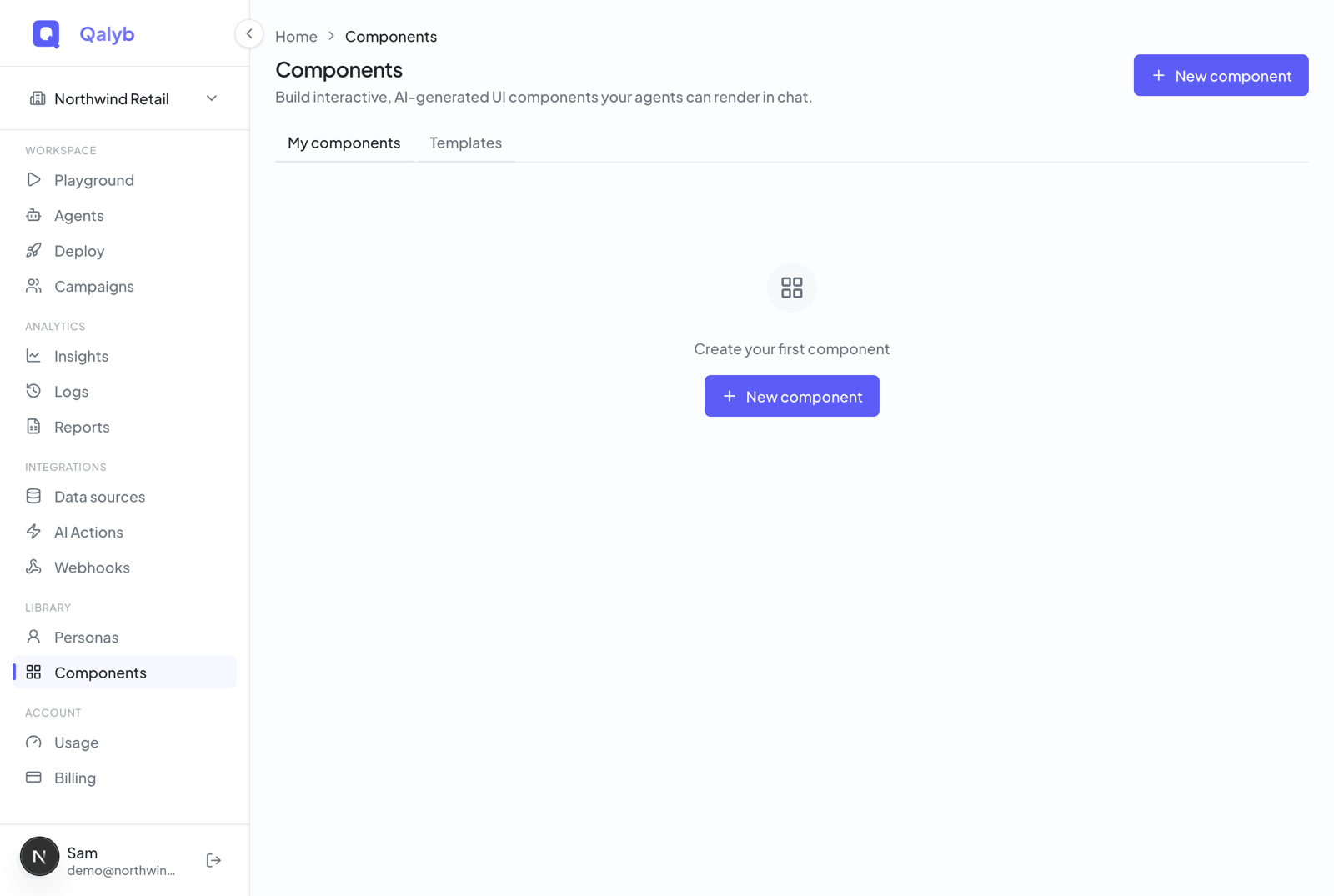
The fastest start is the Templates tab: each card shows a live mini-preview of the real component. Click one to see it full size (with a light/dark toggle), then click Use template — it's copied into your organization and opens in the editor, yours to customize. Prefer a blank slate? Click New component at the top right instead.
A new component opens on the AI Builder tab — a chat where you describe the component and it gets built for you. Pick one of the starter cards (Pricing table, Order tracker, Product card, Contact form) or type your own, like "a class-booking card with a date picker and a Reserve button". Press Enter to send (Shift+Enter for a new line).
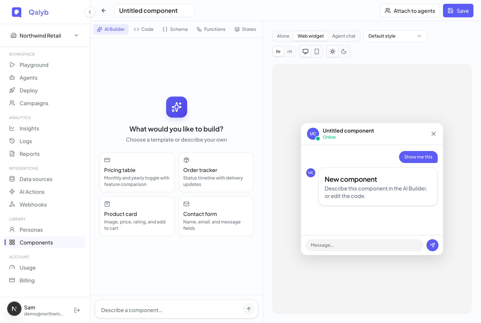
The builder creates the whole component — layout, data, even the name and icon — and the live preview on the right updates. Keep chatting in the same thread: "make the button blue", "add an email field". Each message edits the current component rather than starting over.
Above the preview, switch between Alone, Web widget, and Agent chat — plus light and dark — to confirm it looks right everywhere it might appear.
Click Save, then Attach to agents in the top bar. A dialog lists every agent in your organization with an on/off toggle — each toggle takes effect immediately.
How your agent decides when to show it
Once attached, the component becomes something the agent can choose to render — in chat and in the website widget. The agent reads the component's name and description to know when it fits: a pricing card when someone asks to compare plans, a booking form when they want an appointment. Write the description with that in mind. Detaching removes the link; deleting a component removes it from all agents.
The starter templates
Qalyb ships eleven starter templates, including:
| Template | What it is |
|---|---|
Lead capture, Book a demo | Forms that collect details and hand them back to the agent. |
Product card, Cart summary, Pricing plan | Commerce-style cards for showing items, carts, and tiers. |
Order tracker, Class booking, Weather card | Status and booking widgets with dynamic, data-driven content. |
Stats overview, SHC service menu, SHC property card | Dashboards and industry-specific (real-estate) layouts. |
Managing your library
- Search filters components by name and description.
- The list/grid view toggle near the search box works like other dashboard pages — your preference is remembered per browser.
- Each component's ... menu offers Duplicate (creates a copy named
<name> copyand opens it) and Delete (admins only, with a confirm dialog — the component is archived, not destroyed).
Inside the editor
The editor is a full-screen split pane: a live preview on the right, and five authoring tabs on the left. The top bar holds the name (click to rename), Attach to agents, and Save. Most people never leave the AI Builder tab — the others are there when you want direct control:
| Tab | What it's for |
|---|---|
| AI Builder | Build and edit the whole component by describing it. The default tab. |
| Code | The component's layout, as editable JSON. |
| Schema | The shape of the data the agent fills in, plus example data for the preview. |
| Functions | What buttons, links, and forms do when clicked or submitted. |
| States | Alternate looks the component can switch between (e.g. loading, done). |
Each tab (apart from the AI Builder) has a collapsible "What is…" help panel with a worked example. The JSON editors check your input as you type, showing a green Valid or red Invalid badge — invalid JSON is kept as text but not applied until it parses.
Making buttons and forms do something
Buttons, links, and forms do nothing until you wire them to a function on the Functions tab. Six types are available:
| Type | What it does |
|---|---|
| Set variables | Remembers values inside the component (e.g. which plan was picked). |
| Send message | Sends text back to the agent, so it knows what the customer just did. |
| Call API | Calls a web address on your systems — securely, through Qalyb's server, so your secrets never reach the customer's browser. |
| Open link | Opens a URL, in a new tab or the same one. |
| Dismiss | Closes the component. |
| Run code | Custom client-side code — visible in the editor but not active yet (see below). |
For developers
Under the hood a component is a declarative JSON tree (a small DSL) plus a typed data contract. The Code tab holds the tree — nodes of { component, props?, children? } drawn from a fixed registry of about two dozen primitives: layout (Card, Box, Row, Col, Grid), text (Title, Text, Badge, KeyValue), media (Image, Icon, Embed), input (Form, Input, Select, Checkbox), actions (Button, Link), data (Stat, BarChart, LineChart, Table, ProgressBar, Rating), and control (State, Repeat).
{
  "tree": {
    "component": "Card",
    "children": [
      { "component": "Title", "props": { "text": "{{plan.name}}" } },
      { "component": "Stat", "props": { "value": "{{plan.price}}", "label": "/month" } },
      {
        "component": "Button",
        "props": { "label": "Choose plan", "onClick": "selectPlan" }
      }
    ]
  }
}Embed primitive (a sandboxed iframe), never a raw <iframe> string.Any string prop or child can interpolate data with {{path}} templates — for example {{plan.name}} — resolved against the merged data (default data plus state variables). For non-string values, use { $bind: 'path' }. The Schema tab declares the data's shape as JSON Schema:
{
  "type": "object",
  "properties": {
    "plan": {
      "type": "object",
      "properties": {
        "name": { "type": "string" },
        "price": { "type": "string" }
      },
      "required": ["name", "price"]
    }
  },
  "required": ["plan"]
}
The data schema matters beyond preview: attaching a component to an agent creates a synthetic tool on that agent named render_component_<slug>, whose parameters are exactly this schema. The component's description (plus any optional when-to-use instructions) becomes the tool description. When the model calls the tool with data, Qalyb renders the component inline — in both chat and the web widget. A precise schema means the agent passes precise data.
A new component has no id until its first Save (a POST that then swaps the URL to /components/[id]; later saves are PATCH updates). Generation is one endpoint:
curl -X POST https://api.qalyb.ai/components/generate \
  -H "Authorization: Bearer sk-live-..." \
  -H "Content-Type: application/json" \
  -d '{
    "prompt": "A pricing table with three tiers and a Choose plan button on each",
    "current": null
  }'
On invalid output, generation makes one automatic repair attempt (re-feeding the model its own output plus the validation error). Attachments are managed over the API too:
curl -X POST https://api.qalyb.ai/components/cmp_abc123/agents \
  -H "Authorization: Bearer sk-live-..." \
  -H "Content-Type: application/json" \
  -d '{
    "agentId": "agt_abc123",
    "instructions": "Render this when the user asks to compare pricing."
}'Call API functions go through POST /components/proxy, which is SSRF-guarded: only http/https, with localhost, private IP ranges, and cloud metadata hosts blocked, and an eight-second timeout. Use {{response.*}} in the on-success and on-failure variables to read the result back into component state. Note the structured Functions editor only exposes string values — for richer values, author the function in raw JSON.